

Overview
This was a personal project for me to improve the current UI of the homepage of Canada.ca. I discovered this webpage when researching about Canada from a tourist perspective and immediately defined an opportunity to redesign the homepage to offer users a more simplified experience.
Target Audience:
Canadians, tourists
Deliverables:
User Persona, Empathy Map, Sketch, Wireframe, High Fidelity Prototype
Constraints:
5 day design sprint, limited time for surveying and testing
Sprint completed by a solo designer
Roles:
UX/UI Designer, UX Researcher
Tools:
Figma, Zoom, Canva
Process:
5 day sprint
Problem
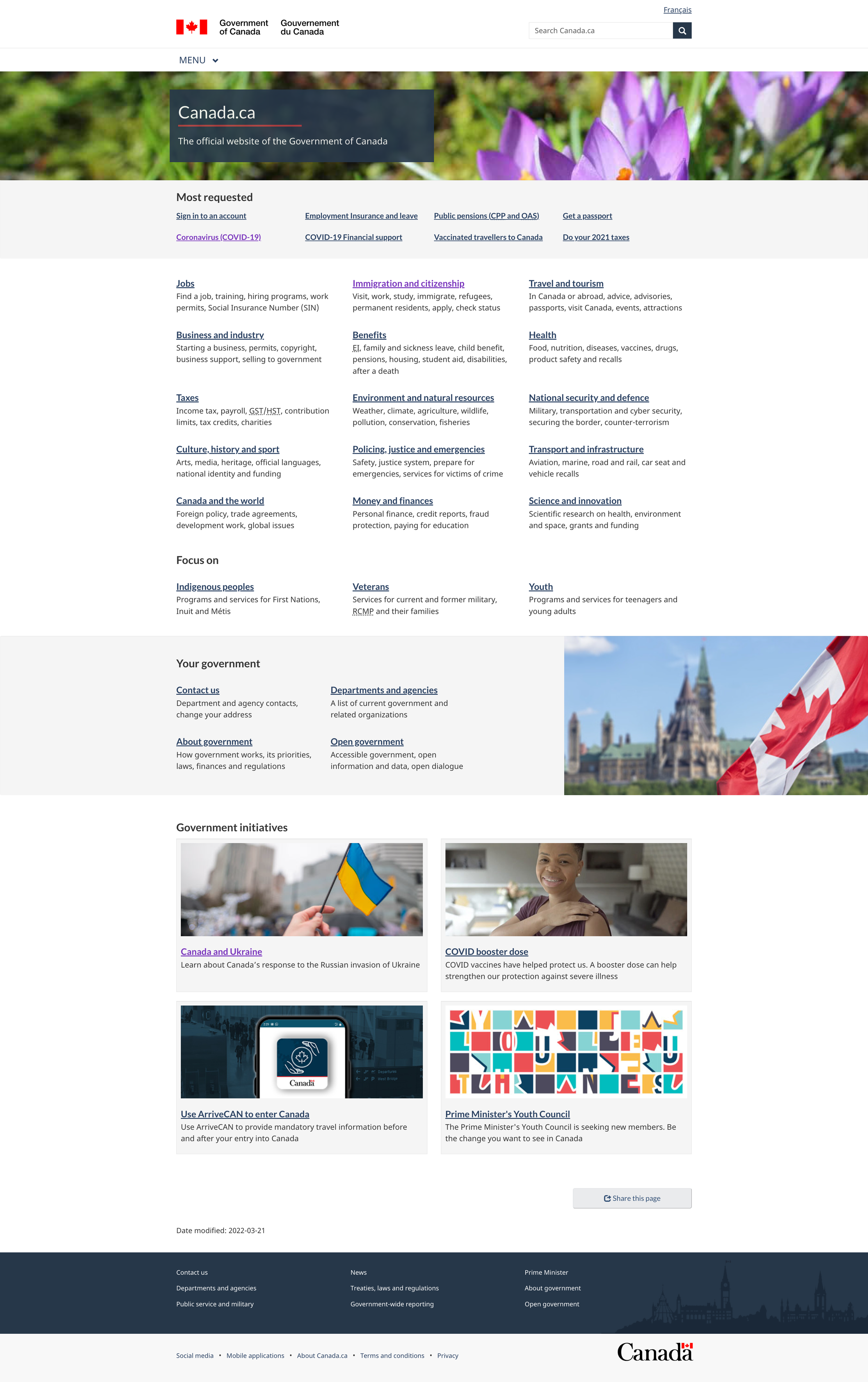
Canada.ca has an incredible number of resources for users to access, whether you’re a citizen of Canada, a tourist looking into travel and tourism, or an individual who wants to be up to date with all things Canada-related. Due to the number of resource links available on Canada.ca, users can feel overwhelmed by it, especially because there is no specific organization to it.

Solution
My solution to this was to redesign canada.ca’s homepage to help users feel more confident in their navigation. Incorporating the search bar allows users to search, in addition to offering general resource links for users too. This eliminates the busyness on the homepage and captures a more modern, simplified look.
Day One: Empathize + Understand
On Day one, I took some time to look over the canada.ca website and take note of areas of the interface I was looking to make improvements on.
Compare + Contrast:
I started by doing a compare and contrast anaylsis. I thought about what Canada.ca does well visually and the important information it relays to the public.
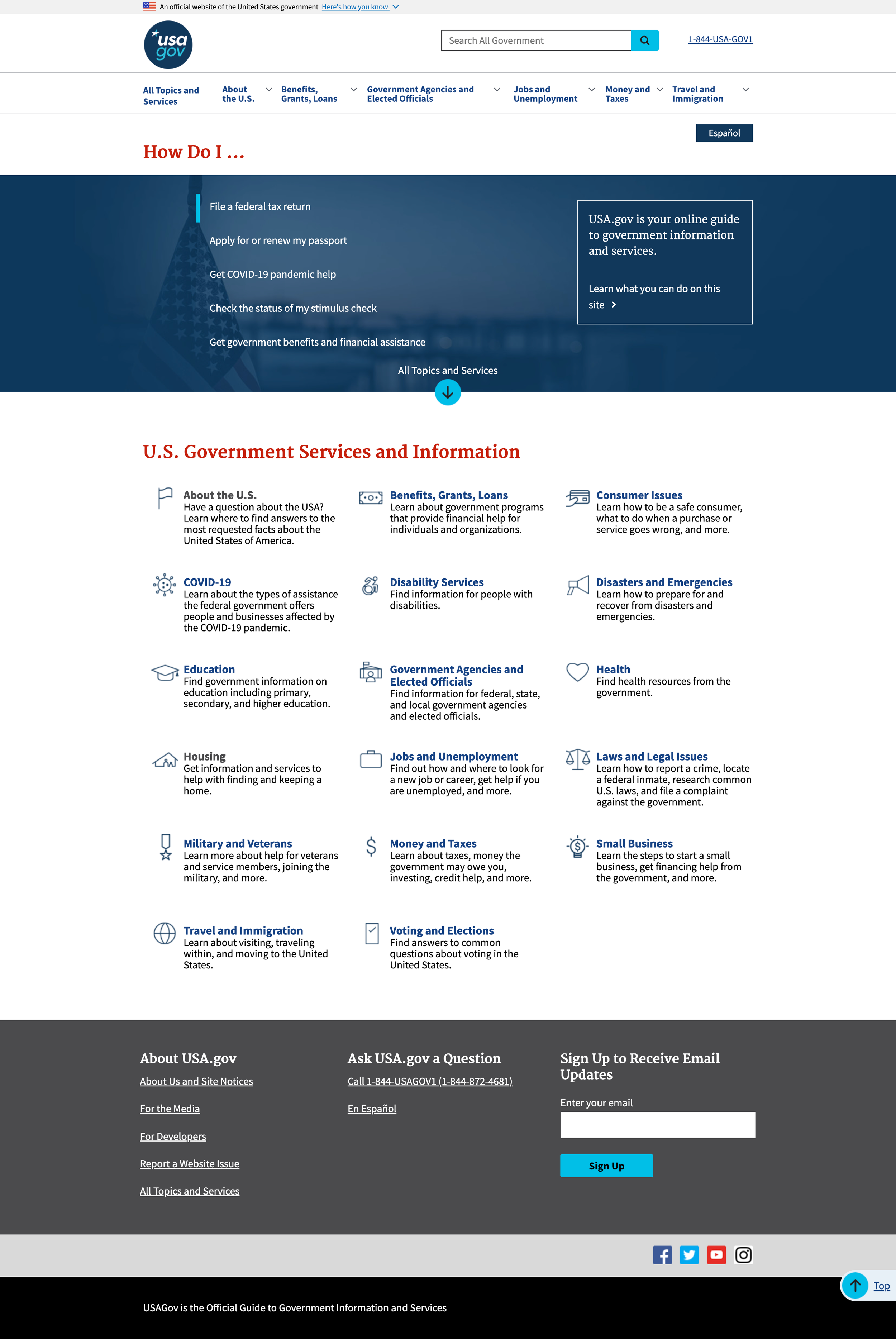
I decided to compare Canada.ca with USA.gov, NYC.gov, and CA.gov. When comparing Canada.ca to the other homepages, it was very clear that Canada.ca limits the number of images and icons to help users navigate through their webpage. Having these images and icons can help the user find what they’re looking for more quickly. So I made this an opportunity for me - to include more images with less words and present a visual hierarchy that pertains to the user’s requests.


Empathy Mapping + Personas
To understand my users more, I created empathy maps and personas. The empathy map gave me a more realistic representation of who my users were and their intentions for coming onto the canada.ca website.
The personas I created represented real world individuals which gave me a more visual representation of the users based off of the empathy maps.


Day 2: Define the Problem
Defining The Problem
I needed to determine the pain points and problem of the homepage, so I can tailor the homepage redesign that better serves users, while keeping the elements of the page that is designed well. To gain further insights into other users’ experiences I conducted quick interviews regarding the homepage experience.
There were my findings:
The interface is too wordy making it difficult to find what the user is looking for.
There is no organization to the homepage screen, random links are listed for the user to search through.
The homepage lacks symbolism of what Canada is.
How Might We…
I began by creating a scope for the problem I intended to solve.

Design a landing page that’s easier for users to navigate
Condense the links on Canada.ca’s homepage
Give a more modern aesthetic that symbolizes Canada
Ultimately, I decided to integrate the first two statements that encompasses a landing page that’s easier for users to navigate by condensing the links on Canada.ca’s homepage. Keeping the visual aesthetic in mind that represents Canada immediately for users would be great too.
Day Three: Sketch + Wireframe
Sketching
With the problem determined and a more solid understanding of what users are looking for, I began to sketch the homepage. Because I wanted the homepage to have a modern, professional look I decided to keep visual elements that I thought Canada.ca already did well, such as the choice of colors. The colors presented on the page represent solidarity, confidence, and professionalism as soon as the page loads for the user.

I created notes to help me before moving onto sketching - that way I can keep to the project goals and include what Canada.ca does well before removing sections and adding all new visual content.

Wireframe Sketch 1:
This is my first wireframe sketch. I took sections of the Canada.ca homepage, keeping what I thought the webpage does well.
Wireframes

Wireframes Version 1:
This wireframe was created based on the Canada.ca website. Instead of including lengthy links, I decided to categorize these links and offer the user to search what they’re looking for.

Wireframe Sketch 2:
The first wireframe did a good job in giving me the visual I needed. From there, I decided to make improvements. I decided to remove the home icon to give the homepage a more cohesive and professional look and included Most Requested links.

Wireframes Version 2:
This is the second iteration of my wireframes. As mentioned in my second sketch, I decided to move away from the home icon and create a fixed header where “Canada” would serve as the home button. Users could click Canada and be redirected to the home screen. Visually, this improved the overall interface of the homepage and gave a more cohesive appearance and professional appearance.
After taking another look at the Canada.ca website, I decided to include the “Most Requested” links for users to reference. That way these links could quickly navigate the user to these specified resource links without having to search.
Day Four: User Testing + Feedback
User Testing
Since this was a redesign of the homepage, user testing was very brief.
I had 2 users launch the homepage redesign and share their thoughts on what they saw on the screens.
Given the scenario, how would you find more information regarding travel, I instructed the users to share out loud how they would learn more
Given the scenario, how would you find community resources and both users promptly pointed to navigation bar to “community” or opted to look it up in the search bar too.
What I discovered is a natural flow experience of he user. They were able to complete the tasks instructed to them and prompted to scrolling through the webpage to explore more.
Day Five: Reiterate + Prototype
Prototype
I moved forward to prototyping after having positive feedback with user testing. By doing the user tests, it helped me determine if the interface worked well for users who were visiting the website.
From my user research, I learned that many government state websites have a large landing image that represents the place. So I decided to also include that into the prototype to give users a clearer picture of Canada.
Final Takeaways
This project gave me perspective into visual design. I was able to practice visual design skills while maintaining project goals.
Understanding how users are thinking as they launch a page can influence their overall experiences and determine if they’ll come back
Enlarging images and removing excess text helps users scan a webpage to find what they’re looking for.
Next Steps
I would like to create dedicated icons for the links to give a visual for users.
Move forward with user research and testing to improve the overall UI Design to match the homepage.