
ZipBUS: Mobile App Case Study
Overview
ZipBUS is a transit application designed specifically with the riders in mind. ZipBus’ goal is to provide a simplified and intuitive experience for riders to navigate around the city by bus.
Roles:
UX/UI Designer, UX Researcher, Information Architect
Tools:
Figma, Zoom, Canva, Google Forms, Google Slides
Process:
3 Week Timeline - Project 1 of Thinkful’s UX/UI Design program
Deliverables:
User Persona, Empathy Map, User Flow Chart, Sketches, Paper Prototype, Wireframe, Lo-fidelity Prototype, Hi-Fidelity Prototype
Target Audience:
Individuals 18+ years with mobile device that can download an application, and must be physically able to ride the bus
Constraints:
Due to a limited timeline of 3 week, survey results could have been improved with more time dedicated towards research.
The Challenge
A metropolitan city recently added a number of bus routes that stopped at the same bus stop - Washington and State. This expansion caused confusion and frustration amongst riders as they were now unable to catch any bus that arrived at this stop. Given that Washington and State now serves 7 major bus lines, riders needed to a way to view bus lines and arrival times in order to reach their destination in a timely matter.
The Solution
To resolve the frustration of riders, the solution was to redesign a bus app that improved how the riders got to their destination. The app was designed carefully to only include features that were necessary to get the rider to their destination.
This meant that the focus needed on a friendly and intuitive design that could be simple for everyone to use. Creating the app meant that riders would no longer have to check online or rely on schedules posted at the bus stops. Instead, they have full accessibility to bus schedules from their mobile device making the experience seamless and reliable.

Process and Requirements
My client is the transportation agency for a midsize metropolitan area in the Midwest with a large network of public busses. Riders could find expected bus schedules listed on their website and at each bus stop. As expansion continues, riders have expressed their frustration of bus time and line arrivals. To help fix this problem, I was tasked with the job to design a mobile app that would resolve some of these problems, specifically at Washington and State stops:
Ensure that any rider can tell when each of the buses arrives at the Washington & State bus stop.
Ensure that all riders can tell how much time they have to get to the Washington & State bus stop before the bus they need arrives at that stop.
Allow riders to select one of seven bus lines to see a list of its future arrival times at the Washington & State bus stop.
SWOT Analysis
To help me get a better idea of mobile transit apps, I conducted a competitive analysis on 3 different transit applications: CityMapper, Moov-It, and Google Maps.
I wanted to learn what features were common amongst the 3 apps, so I explored and found commonalities in all 3 applications. These features included accessibility to a map, viewable bus arrival times, and route guides.

Strengths:
The ability to search based on current location
Having access to a route guide that indicated every stop on their route.
And responsive interface amongst the 3 applications
Improvements:
An abundance of in app features (specifically when using the CityMapper app)
For new users, it may be difficult to navigate around the application because there’s an excess of icons on the screen.
Limited cities available for bus transit navigation specifically w/ CityMapper. CityMapper has yet to expand into smaller city areas.
Google Maps also has some issues with accuracy - reports show that it struggles sometimes to produce a route that gets you to the destination that was requested.
Opportunities:
Strong market of users
Available in many cities across the US
Include alternative transit options
Real time tracking
Threats:
Multiple competitors that offer similar service
Intuitive in app features (saving destination,
COVID-19 updates and regulations
User Research: Surveys
After doing a competitive analysis, I moved into user research. To help me define the problems that riders were facing, I conducted a survey and collected a total of 30 responses.
Given that I had a short timeline to get my research done, I acknowledged that this was a constraint that I faced in my design process, however, with the data I’ve gathered, I gathered some insights.
From my survey, I wanted to learn what features were being used in other applications. I also wanted to learn how bus riders felt about their overall experiences with their current app. By understanding these two key factors, I was able to conclude which features were important to the user.


Survey Results
Surveyors who responded that they were bus riders were presented with this question: What features do you use most?
The survey results indicated that the map, route times, and bus routes features were used the most. This signified the importance of these features and that it was important to add to the redesign of the transit application. The results also helped me align the problems riders were experiencing at the Washington and State stops.
Interview Findings
Next, I moved on to user interviews to give me in-depth insight into what users need. So I began to ask, “What exactly are riders looking for?”
From my two participants, I learned that my interviewees both used Google Maps because they felt it was easy to use and provided them with the bus times and route. They noted that these were features that were useful to them in the app because it helps them plan and get to their destination on time.
One interviewee also stressed the importance of having accurate times reflected on the app so time so they’re not “waiting” around for the bus to arrive. It was very clear from the interview that time real-time scheduling was an important feature to have in order to avoid riders wasting their time.
When asked about any other apps my interviewees have user in the past, one interviewee shared his thoughts about CityMapper as: “ I liked that they had a lot of features but it also could make navigating confusing sometimes too.”
So, this indicated to me to go with the approach of LESS IS MORE. By simplifying their transit experience, it may make it more likely for users to use the app again.
Maps and Personas
To help me understand who my targeted users were, I created maps and personas.

Persona: Cheyenne lives in large city and utilizes public transit for her daily travels. She wants to spend less time waiting for the bus so she has more time for her pets and hobbies.

Persona: Carl is a project manager in Chicago who relies on bus transit to help him get to work. He not uses it for his commute but it’s a great way for him to eliminate costly parking fees and driving in traffic. He also benefits from the bus because it offers a safe mode of transportation to all his favorite places.

Empathy Map: Cheyenne feels the bus is a great way to navigate around the city and loves that she can explore while saving on expenses by not having a car. However, she spends a lot of time waiting for the bus arrive and finds herself confused by the number of buses that stop at one bus stop.

Empathy Map: Carl has mixed feelings about the bus transit system, but feels it has a positive impact on the world and can often rely on it to get where he needs to go. It also saves him a lot of money! He feels that having an app could improve his overall experiences with the transit system.
User Stories
I generated user stories based on my research. I thought about what tasks my users wanted to perform and categorized them based on their level of importance. The tasks that were listed as the highest priorities were in sync with the problems that I intended to resolve.
My user stories were:
As a rider, I want to know what bus is arriving.
As a rider, I want to know when the bus is arriving.
As a rider, I want to know how much time I have before the bus arrives.


Sketch
With the user stories fresh in mind, I began to sketch the user flow.
I initially started with a simple design as I thought keeping things simple would make it easier for my users. However, I was missing what interactions and steps a user would take on each screen. So I went back to the drawing board and sketched my user flows again.
User Flow
In my original sketch, I drew 2 user flows to accomplish 3 user stories. After receiving some feedback on my user flows, I was able to remap the user’s flow and create one flow to successfully accomplish 3 user stories. As an added feature to the app, I also included a user flow for a rider using the “Trip Plan” feature.


Wireframes
When I began sketching my wireframes by hand, I had a few goals in mind. I kept the words simple and friendly in the back of head to iterate a design that would be intuitive and simple to use design. I kept referring back to who my target audience was by referencing the user personas and empathy maps I created. This helped me to stay on track with the business goals to only create screens with features I thought were necessary.


When I was content with my sketches, I moved onto wireframing on Figma and created a total of 7 screens for riders to navigate through. I included a “Plan Your Trip” feature because I thought it was a feature that could be helpful for riders to use when calculating how much time they had before their bus arrived.
Throughout this process, I referred back to my competitive analysis report to look for elements I found were common amongst other transit apps and found ways to incorporate it into my wireframes. Instead of emphasizing on the number of features available, my design thinking was to stick with what feature users wanted.
After receiving feedback, I made some minor changes to my wireframes to reflect a user path that was more succinct with a better user experience.
Low Fidelity Wireframes

Branding and Typography

When thinking about the branding process, I came up with the name ZipBus rather quickly. I chose “zip” because that word signifies quickness and is defined as “to move with high speed” and added “bus” since the bus is rider’s means of travel. I chose to design with a more modern approach catered to individuals of all ages.

As I finalized the logo image, I also thought a lot about the colors I wanted to use. Essentially I selected colors that signified trust, friendliness, accuracy, and simplicity because these are adjectives that I wanted riders to align with the app. By incorporating the mustard yellow into the app, I’d also be able to make buttons stand out on each screen, in efforts of helping the riders.
When selecting fonts, I decided to use only one font. I decided to use Roboto Serif as my typeface because it is a font that is easy for users to read. My main focus was keeping the design simple to make sure there weren’t unnecessary distractions for the user.
Usability Testing
To test if the application was able to resolve the problems riders were facing, I needed to conduct usability testings. I performed this test with two individuals.
User 1, my first tester, appeared to be mostly successful as he moved through the screens. His feedback after the testing was to include a way to let riders know how much time they had before the bus would arrive, rather than just giving them the actual time of arrival for the buses.
User 2, on the other hand, experienced a lot of confusion and frustration because the user flow did not quite make sense to her. After the test, she provided feedback to me, to let me know that the path of the user does not flow in the order I had it in. For riders who are solely looking for nearby stops, she expressed to me that there was no need to have a route guide because that would be a separate feature for riders who are trying to get to a destination. So the way the screens were connected caused disruption in the flow.
I found the usability testing part of the design process the most insightful. It allowed me to observe users first-hand and record any frustrations or confusion the users encountered. From the feedback of my users, I reiterated on the design and decided to implement one feature that would allow users to review bus stops nearby, arrival times, and routes. And as an additional features, users who want to know how to get to their chosen destination could utilize the Trip Planner feature to plan their trip.
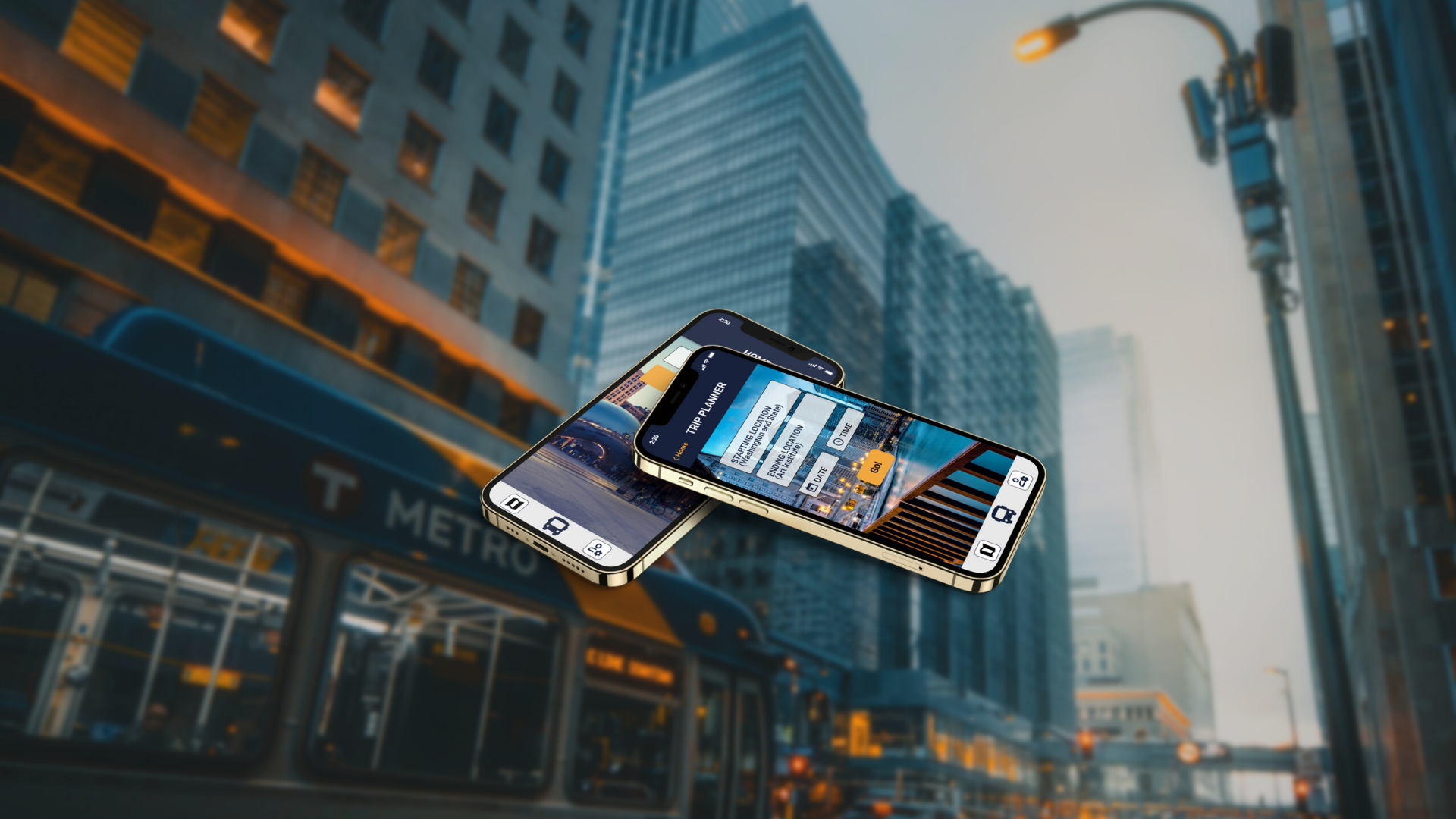
03 | Prototype
High Fidelity Prototype
With the information I gathered from the usability tests, I reiterated the overall design of the application - this meant deconstructing screens and creating new ones, reorganizing, and wireframing again. Afterward, I worked more on branding and visual design to bring a modern and simple feel to the application. I implemented slide-up features when riders are on the Bus Lines, Arrivals, and Route Guide screens to create an intuitive experience while using ZipBUS.
Interactive Prototype and Final Prototype Screens

04 | Final Takeaways
Given that this was my first design project, the entire experience was a learning experience. I gained a better understanding of the design process. Creating user personas and empathy mapping helped me define who my users were. I found myself constantly referring back to the goals to make sure the solutions still aligned with the project goals.
I would have liked a larger sample size and more time to conduct usability testing.
Thinking Ahead
Real time data to support the app so users are informed of any changes
How would ZipBUS compare to other apps already on the market? What additional features would users expect of ZipBUS, so they don’t have to use a different app to accommodate their needs?